Thursday, May 10, 2012

''Sculpture Center Reaction''


For our third field trip we went to Sculpture Center a museum located in queens currently on view Bill Bollinger art work. For me to get done this reaction was kind of a challenge because I didn’t understand the concept of the artwork presented. To be crystal clear I had to Google about bill Bollinger. This really was a new experience for me because this exhibition is drastically different from the others I have seen in others museum with a different perspective.

Our professor told us to look for three artworks and explain how each of this artworks change our perception of the space.


For my first artwork I choose ‘’Graphite Piece’’ this work was in a white room and half of the floor was painted in black. It looked like someone walk on it while it was wet because it had footsteps. For me I think that painting half of the floor in black made the room smaller than it was.

My second artwork is ‘’ untitled’’ it was a water tank full of water. It was in the middle of a room it wasn’t place in a expecific location it looked like they just left it there. This tank kind of reminds me of my native country Dominican Republic because in DR we used these tanks to save water.


My third artwork is ‘’ untitled’’ this artworks are two wheelbarrows full of water I didn’t know what was the meaning or the concept of this work it looked kind of awkward to me and very minimalism.


Lastly this Homework was a real challenge for me. I think like in order to understand Bill Bollinger artworks you got to be really in to it. Because for someone it could be art but for me all I saw were common things that I see in my daily basis. I kind of figure that everything around is art but we all have different perspectives and ways of seeing things. What could be cute for you could be ugly to me.


Bill Bollinger
                                                                                       ''Graphite Piece''
                                                                                   1969


Bill Bollinger
                                                                 ''untitled'' 
                                                                                                               1970


Bill Bollinger
                                                                  ''Untitled''
                                                               1970

Sunday, April 22, 2012

“Design in Our Lives”


The past week we went to the MOMA museum to the Architecture & design floor. We had to choose four different art works from that exhibition. Two of the works must have ‘’ High functionality’’ and two with ‘’low functionality’’. Where some of the objects are made of real world utility and some of them less practical.


The two artworks that I choose for ‘’High functionality’’ are the following. The first work that i choose is called ‘’Corefab#116’’ of Ammar Eloueini. This work is a well-designed chair made by common objects. This architectural design is very useful because everyone use this object at certain moment of the day. For ex. When we go to a restaurant we sit in a chair when we go to a park or when we eat or we are tired we sit in a chair. I found it very interesting that we can make an object that is so popular with stuff we could never imagine. My second artwork is called ‘’One Shot ‘’ of Patrick Jouin. This artwork is very similar with my first high functionality artwork. They both complement each other because we use them either when we eat or we go to a restaurant we use a chair and a table. I found this artwork very interesting because this table looks very unusual and very modern for this century we live in.


For my ‘’Low functionality’’ artworks I choose the ones below. My first low functionality is called ‘’ Spin Chaise Carbon Fiber’’ of Mathias Bengtsson. I liked this artwork is really weird and is kind of interesting but I didn’t find for what can you use this piece.my second low functionality work is called ‘’Cries & whisper’’ by Hill Jephson. I found this artwork really nice but no is useless. But I like the meaning it has for the artist. Sometimes we don’t see the real meaning of the stuff that are important for others.

In this field trip I realize that not all the designs or architectural designs but most of them have a personal connection with the artist that we might don’t know but for the artist it means a lot more that we could imagine. Something that may appear ugly or irrelevant for us could mean the world for other even the most insignificant thing.


Ammar Eloueini
                                                                   ''Corefab#116''

Patrick Jouin 
                                                                  ''One Shot''

Mathias Bengtsson 
                                                                                           ''Spin Chaise Carbon Fiber''

Hill Jephson Robb
                                                                              ''Cries & Whispers''

Tuesday, April 3, 2012

'' Illustrate a Story ''


 I choose this story because I found it very touching and make us realize what is really important in life and what we all have but we don’t see or appreciate and what we all enjoy but some of us don’t get the chance too. the chance to live to be born healthy. In the story the 12 year old kid called Grant tell us all the things he went thru during his illness. Also what caught my attention was something he said ‘’ if you’ve been close to death you will understand life more’’ that make me realize that we all complain about material things but we don’t appreciate what we already have.In my collage I wanted to portray the moment grant thought he won’t enjoy life.

“MoMA PS1: The Good, the Bad, and the Misunderstood''

On our second field trip we went to MOMA PS1. Where we were suppose to look for three pieces of art. One we liked one we didn’t like and one we didn’t understand. Many of that artwork that was on exhibition on MOMA PS1 I hardly understood the meaning of them.


An art that I didn’t understand was from the artist Henry Taylor. In his artwork that he called ‘’Jungle’’ he tries to express his idea using several components which confuse me. He used an endless amount of stuff in his artwork that totally confuse me and don’t tell me the exact meaning of the art. I really like this work I found it very interesting but in the same time confusing. But I really liked the idea idea of putting all this elements together and make it interesting for the audience is an art that caught your attention. I would really like to know the meaning of this work.

However, an art that I really enjoyed was from Henry Taylor a portray of  Huey Newton. I found it very interesting because in this portray he tell us a story. Huey Newton was a former lawyer in San Francisco. He joined the forces to establish the ‘’Black Panther Party for Self-defense’’. He coordinated protest against violence to African-Americans. What I appreciate about this artwork is that his fighting for equality and I found it very interesting because racism is still and always will be a worldwide problem that we should fight against it. And in his artwork everyone can feel connected because racism happens every day and everywhere.

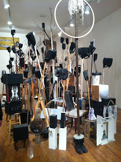
Moreover, an art that I didn’t liked was by Carmine Boccuzzi and Bernard Lumpkin called ‘’Rock It ‘’ I didn’t like it because it has too many elements and I didn’t feel connected with it. What turns me off is the idea of this artwork of the mannequin head on top of those boxes.

This trip to these museum make me understood that not all the art you see wont give you the message right away some of them you have to sit and try to found out what they trying to portray on those artwork. Because all of them have their own meaning but not all of us will capture it.


Henry Taylor
                                                               ''Jungle''

Huey Newton
                                                         ''Untitled''
                                                 2007

Henry Taylor
                                                               ''Rock It''
                                            Collection Carmine Boccuzzi and Bernard Lumpkin
                                                        2008

'' Art: 21 Transformation Reaction ''

For my transformation reaction I choose Cindy Sherman because I feel more familiar with her since I saw all her art work at MOMA on our first field trip. Cindy Sherman altered her physique and surroundings to create characters from clown to aging socialite. She uses herself to capture in a range of personas that may appear amusing and disturbing. Sherman work relates to transformation because all her work is about the process of how someone would physically change from human to anthro or an animal. She embodies all this transformation to express her idea.


Sunday, March 25, 2012

Art and Identity : ''The Museum Of Modern Art''

For our first field trip to MOMA (Museum Of Modern Art) we were suppose to choose three works of art that embodies the topic identity of art. we were supposed to concentrate on two exhibitions: “Cindy Sherman” and “Contemporary Galleries: 1980-Now”. We must choose three works that represent; individual, cultural & historical art. Also we have to explain how does each work embody its classification of identity.

For my individual art I choose a work from Nan Goldin an American artist who embody his identity of art by the classification of indivial. He portrays a couple kissing also offers insight into the individual self-expression. Individual identity is what shows what makes you and what you like and what differ you from others.

Meanwhile, cultural identity can be expressed through certain styles of clothing or food. Many people can be identify their culture by location, gender, race, history, nationality, language, sexuality, religious, beliefs or ethnicity. United states where the population is ethnically diverse and social unity is based primarily on common social values and beliefs. For my cultural identity I choose the art of Marlene Dumas a South African artist who embodies the African culture standing against a wall.

Furthermore, some piece or an object from something that has pass years ago that from certain manner is important for some of us and our culture to create history can express historical identity. For history identity I choose an artwork from Doris Salcedo. Her work was inspired by the recent history of her native Columbia. Doris Salcedo creates sculptures that address the effects of war, political oppression, and other acts of violence. Her works tell harrowing tales of trauma and affliction.

Lastly, these identities can help us define our identity as a person and create a background. to do so we should be able to distinguish between members of our own. Being conscious of your identity also allows us to manipulate or to change how others perceive you. Awareness of our identity is important because it helps us make our way through the world. Also , distinguish our identity by culture , indivual & history.

Nan Goldin
Philippe H. and Suzanne Kissing at Euthanasia , New York City.
1981


Doris Salcedo
Untitled
(1992-93)


Marlene Dumas
Wall Wailing
2009

Saturday, March 17, 2012

''Narrative Digital Collage''

All collage tell a story and this collage is about my vacations in my country Dominican Republic. I really loved it  and needed took of break of this crazy city for a while .I spend time with my friend from childhood and had a great time eating and going out and enjoying the warm weather.  Cant wait to experience it once again.Also im sharing a lil part of culture and what I love the most of my country. Love our beaches that are tourist routes to the world and our food and multiple things that i missed so much that i didn't realize i had until you lose them.Dominican and proud to be able to share my experience and culture with someone else so they can know how lovely is my country.